SureChoice: Making Informed Insurance Decisions
Health insurance is confusing. Last year, after Annie and I got married and she started a new job, she came home from orientation day with the book. The book of health insurance plans, complete with overcomplicated tables of costs and percentages, interspersed with pictures of smiling people. I assume they’re smiling either to make me — the daunted reader — feel assured, or because they know they’d be screwed in the U.S. without health insurance. But that’s another issue.
Choices, Choices
The problem with displaying a health insurance plan using many tables is that it’s very difficult to make comparisons between plans. One plan might be more costly than another in certain categories but not in others. One might have a low deductible while the other has a high co-pay. Yet a third plan might have a very middling premium and comes with a Flexible Savings Account. Even if I know what all these terms mean and how they interact with one another, it’s still hard to discern which would be best for our family’s specific health needs. And, to top it all off, I can’t know if I’m getting a good deal since insurance rates are negotiated between insurance companies and employers, and there’s very little info available online to compare with.
This, I think, is where uncertainty sets in and some word-of-mouth advice can end up replacing mathematical reasoning for some people. (Or, for those who grew up in the 2000s, maybe you have a vaguely negative feeling about HMOs because of Melman from Madagascar.) But Annie and I wanted grounded answers, so we went to our whiteboard, scribbled a ton of math and graphs, argued about said scribbles, eventually came to realize we agreed about everything we were arguing over (classic), and got to work.

Cutting Through the Jargon
A big part of this for me was simply understanding what all these health insurance words meant. Here’s what I learned (feel free to skip if you know this already).
- A premium is a cost you pay every month just for being on insurance. Think of it like the cost of a Netflix subscription, but more expensive and way less entertaining.
- A deductible is a set amount of medical costs that you are 100% responsible for. Insurance is only going to kick in and make things cheaper after you “meet” your deductible.
- A copay (co-payment) is the percentage of medical costs you’re responsible for after your deductible is met.
- An out-of-pocket maximum is the maximum amount of money you will be responsible to pay in a year.
Let’s work this as an example. Say I have Plan A, shown below.
| premium | deductible | copay | out-of-pocket maximum | |
|---|---|---|---|---|
| Plan A | $200 | $500 | 20% | $4,000 |
Say my plan starts in January, and the first three months go by without any doctor appointments, prescription refills, etc. By the time March has ended, I’ve paid $\$200 \times 3 = \$600$ in premiums. Then, in April, I get an infection and need to see my primary care physician. The doctor is charging me $\$75$ for the visit, and the medication they prescribed is another $\$75$. Because I haven’t met my deductible yet (premiums don’t count!), I have to pay the full $\$150$. I’ll also, of course, have to pay my April premium of $\$200$. (This whole healthcare thing is expensive, isn’t it?) Time goes on, and by October my family has paid $\$500$ out-of-pocket. But crisis strikes: I get in a car accident and break several bones. I’m rushed to the hospital via ambulance, and have to spend several days in the hospital getting stabilized and getting casts set. Our bill comes out to be $\$25000$. But because our copay has now kicked in, we’re only responsible for $20\% \times \$25000 = \$5000$, and we only have to pay $\$3500$ of the bill before we hit our $\$4000$ out-of-pocket maximum.
Whew.
A Piecewise Function
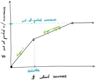
I made many simplifications to the healthcare system in my example above, but a year on health insurance can roughly be split into three stages: paying 100% of costs until meeting the deductible, paying only the copay percentage of costs after the deductible, and paying 0% of costs after hitting the out-of-pocket maximum. If we were to plot this with the x-axis being the total medical costs without insurance and the y-axis being the out-of-pocket costs with insurance, we’d end up with something that looks like:

Once Annie and I saw this, we realized we could plot all of our plan options onto one graph and immediately be able to see what would cost us the most depending on the medical costs we incurred. We only needed to add in the annual premium costs to see a decent approximation of everything we’d spend on health insurance in a year with each plan.
Building SureChoice
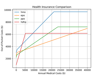
I quickly threw together some MATLAB code to compute and plot the piecewise cost function for each of our possible plans. What we found cut straight through the sales language in our plans booklet and made everything quite concrete: the best plan for us had everything to do with the medical costs we would have. Here’s an example plot:

Every line in the plot shows how expensive that plan would be if we had the total annual medical costs shown on the x-axis. The HMO plan (blue), for example, is almost always the most expensive plan (except for the $\$3000$–$\$9000$ range, where it’s better than the HDHP plan). If we knew we were going to have over $\$30000$ in costs, the HDHP plan is the best. If we were going to have under $\$5000$ in costs, everything but the HMO plan is roughly the same. The EPO plan basically wins out in all other cost ranges. All in all, this kind of visualization helped us to make the most cost-effective choice for our expected medical expenses.
I’ve recently cleaned up my code, ported it to Python, and put it up on GitHub for anyone to use (…assuming you know how to run Python code). Hopefully it can help you like it helped us, and if you have the skills to turn this into something easier to use (a web app, etc.) go for it! We might not be able to change these confusing systems, but we can at least make them easier to navigate.